Open-Source UI Toolkit Design System for Unity 6.
by Vicente C.
Published |
356
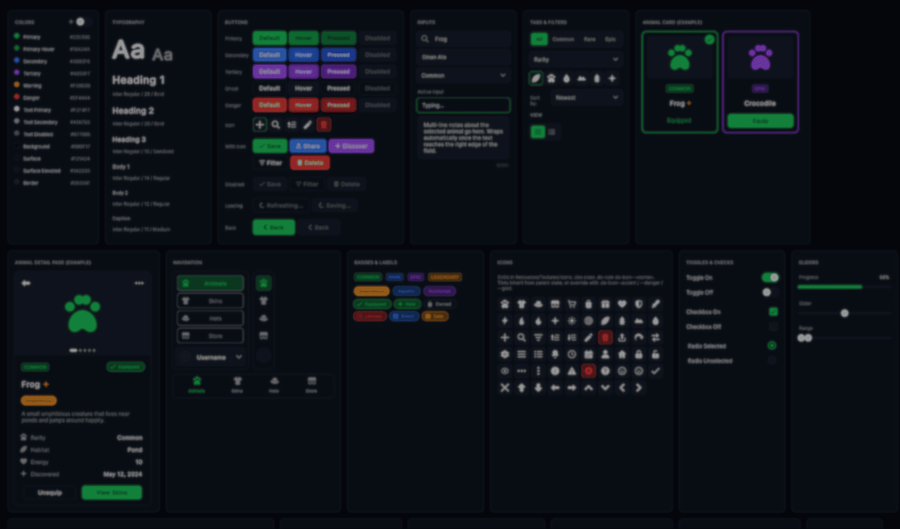
Solo developer Sinan Ata released the UI Toolkit design system they created for their upcoming multiplayer game Leap of Legends, deciding to make the whole project open source after receiving positive feedback from other developers.
The system is made for Unity 6 and includes things like:
- Shared button and menu styles
- Themes and reusable UI components
- Mobile layouts and responsive spacing
- Icons, transitions, and runtime helpers
The idea is to have a toolkit that allows one to reuse the same UI pieces for every Unity project.
is this a thing? should I open source the UIToolkit design system I've built form my game?
by u/sinanata in Unity3D
One of the main parts of the system is the token layer. But why? Because instead of hardcoding colors, spacing, border radius values, or animation timings across different files, everything is stored as CSS variables inside a single USS file.
:root {
    --color-primary: rgb(34, 197, 94);
    --color-bg: rgb(11, 15, 23);

    --radius-md: 10px;

    --space-md: 12px;

    --motion-fast: 120ms;
}
According to Sinan, this made it much easier to keep menus, HUDs, settings, and store screens visually consistent across the whole game, without having to tweak much of it.
The buttons follow the same idea. Instead of creating separate button styles for every possible state, the system uses reusable modifiers and pseudo-classes like :hover, :active, and :disabled.
.ds-btn--primary {
    background-color: var(--color-primary);
}

.ds-btn--primary:hover {
    background-color: var(--color-primary-hover);
}

.ds-btn:disabled {
    opacity: 0.4;
}
The same system is also used for themes. For example, the project includes a light mode that swaps the original variables through a class, and the rest of the UI updates automatically from there.
toggle.RegisterValueChangedCallback(evt => {

    if (evt.newValue)
        root.AddToClassList("theme-light");
    else
        root.RemoveFromClassList("theme-light");
});
Another part Sinan focused on was mobile support. Rather than maintaining separate layouts, the system adds a .mobile class to the root element. Then, the USS overrides handle the larger buttons, spacing, and touch-friendly layouts from there.
if (Screen.width < 768)
    root.AddToClassList("mobile");
Some parts of the system also required runtime code because USS alone was not enough. Things like looping spinners, toggle knob injection, and skeleton shimmer effects run through a helper script attached to the UIDocument.
void StartSpinners(VisualElement root)
{
    float angle = 0f;

    root.schedule.Execute(() => {

        angle = (angle + 6f) % 360f;

        root.Query(className: "is-spinning").ForEach(el => {
            el.style.rotate = new StyleRotate(new Rotate(angle));
        });

    }).Every(16);
}
There is a live demo to showcase the system, where you can hover UI elements to inspect the selector chain and see how each component is structured internally.
If you want to see more from Sinan or check out Leap of Legends, the links will be right below.
Interested in learning more?
If you’re interested in learning shaders in Unity, The Unity Shaders Bible covers everything from the basics of Shader Graph and HLSL to more advanced topics like lighting models, ray marching, and compute shaders. 📘
Interesting fact: Most of the technical artists hired in the game industry know Python, C# (or C++) and HLSL. 👀
— Jettelly Inc. (@jettelly) December 5, 2025
And The Unity Shaders Bible can definitely help you get there. ✨
🔗 https://t.co/fw4pna2vUj#gamedev #unity3d #madewithunity #indiedev pic.twitter.com/nnMiBdXhJm
Jettelly wishes you success in your professional career!
Did you find an error? No worries!
Write to us at [email protected], and we'll fix it!
Level up your VFX skills in Unity with our best seller!
We invite you to explore "The Unity Shaders Bible", a comprehensive book on the concepts and fundamentals seen in this post.
Other posts that might interest you.
-
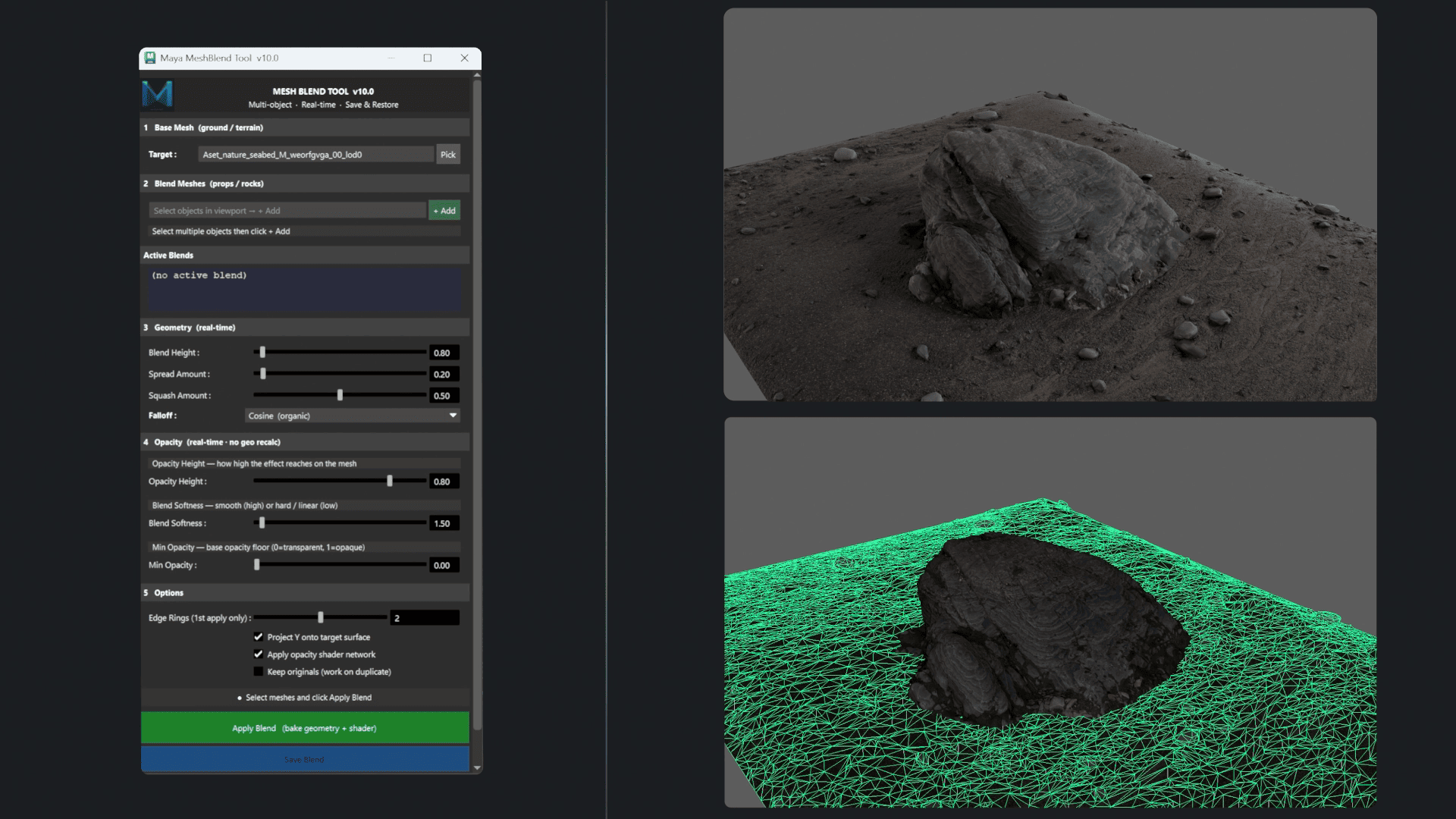 See how MeshBlend works, a Maya tool by Louis Cresson that blends the base of 3D assets with terrain geometry in real time.
 -
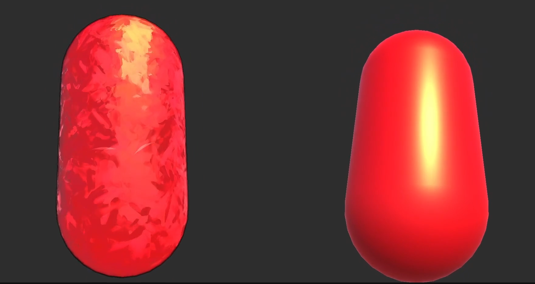 Developer tantaneity showed us how they recreated a painterly Blender shader in Unity URP.
 -
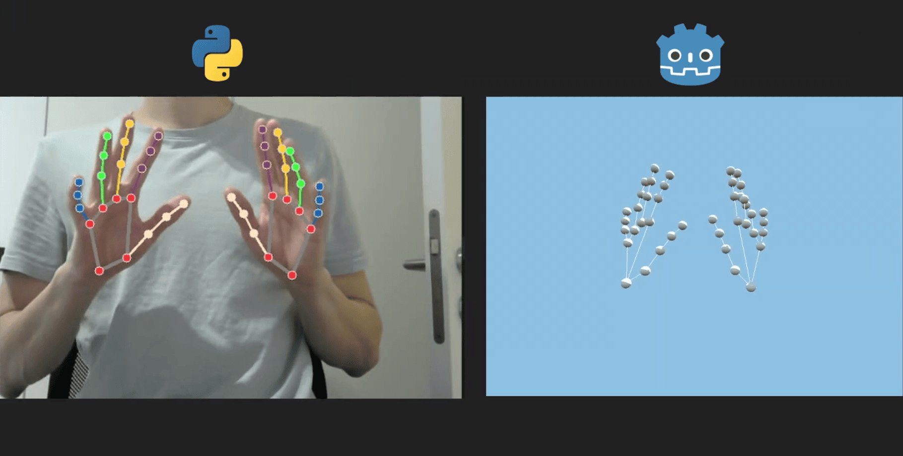 Developer Florian Trautweiler shared how he used Python, MediaPipe, and Godot to create real-time 3D hand tracking using just a webcam.